
Here is what I have come up with:
The black and green are to tie in the chairs that will be in both the ceremony space and the ballroom where dinner will be held. The middle color is supposed to represent bronze and hints of gold. Metallic colors are hard to create in photoshop. The next color should be considered a bronze-y, deep red, and the one on the far right that you can hardly see is supposed to represent ivory, although putting it next to the red like that kind of makes it look light pink. I can't wait to start pulling an inspiration board together once I get home.

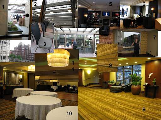
And a reminder of what my venue looks like...
I feel like it is going to come together really well! Not too matchy, but will still be able to stand together cohesively.


3 comments:
It's so annoying how you can't get metallic colours to show up properly on computer screens, isn't it? Your description clarifies it perfectly though and I think it's going to be fabulous! :-)
JENNA this is where one of my classmates just got married in december! she told me all about it and loved it! i am going to ask her more now that i know this is your venue. her pictures looked so awesome. it's going to be so amazing.
ally-I want to see some of those pictures if you can get them to me. Let me know if she has any advice about the place!
Post a Comment