
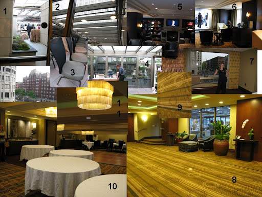
1. A view of the atrium where the ceremony will be held. Very light and bright and structural.
2. The beams we are going to be able to hang candles from.
3. The chairs that the hotel provides. We would like to use these instead of renting chair covers. I'm spending so much money elsewhere, I have to find ways to cut the budget on un-necessary items like chair covers.
4. That man is standing right where we will be. The doors will have to be closed, but a nice little garden sits right behind where we will stand.
5. The library where we will greet our guests right after the ceremony. I heart this room.
6. Another shot of the library. You can see the ceremony atrium right behind it. Don't you just love that white chair?
7. The room where we will set up our photo booth. Something is going to have to be done about those curtains. Guests will take photos in front of the open window with the city lights in the background.
8. The room right off the elevator where appetizers will be served, the guest book will sit, etc. Guests stop off of the elevator right into this room before they walk into the ceremony so it will be the first thing they see. I want the "theme" of the wedding to really come together in this room.
9. A shot of the carpet in the appetizer room.
10. The great room where we will have dinner, possibly a little dancing, and toasts
11. A closeup of the chandeliers that I love!
So what do you think? Right now I am thinking greens, bronze, hints of red, and black. I loved the newest post about nudes at Elizabeth Anne Designs, and so maybe that would be an option as well.
I need your help!


3 comments:
Great venue...very warm. I fully support working with your venue and not against it. I think it'd be easy to just go with earth tones but that would be too matchy and nothing would standout...contrast is good. I like your idea of bronze and I like the idea of a rich/dark red as well. Nudes I think might possibly looked washed out...or blend too well.
I also like the possiblity of a darker purple (not bright). Like the darker flowers in this dress http://shop.nordstrom.com/S/2971648/0~2376776~2374327~2374331~6014133?mediumthumbnail=Y&origin=category&searchtype=&pbo=6014133&P=2 or the color of this dress http://shop.nordstrom.com/S/2991855/0~2376776~2374327~2374331~6014133?mediumthumbnail=Y&origin=category&searchtype=&pbo=6014133&P=1
Wow, the venue looks fabulous! What is that style...? 70s? I don't know about the colour scheme but it would be amazing to keep the design theme of the place going through the invites etc. to really tie it all together.
miss capitol hill-Always coming to my rescue with your fantastic links. I had fallen in love with the idea of purple, and it looks like a really really dark shade might work out okay. Love that second dress though, great potential bridesmaid dress option!
guilty-When you first said 70's I was so turned off. But I have been shopping for jewelrey in Rome for the wedding, and everything I am buying is TOTALLY 70's, LOL. I think once I can settle on a color scheme I can start to think about how to tie the whole place together. You inspired me to think about modeling my invite design after the circle and lines pattern on the floor when you walk off the elevator.
Post a Comment